back to top
Monday, November 18, 2024

Do You Not Want To Know The Story Behind Your Favorite Logo?

There is a story behind everything. Ever wondered why the logo of a company has ‘F’ in it and why not small ‘f’? It just encompasses your mind, isn't it? And most of the times it is just unnecessary to notice or give it the time that it actually needs. I mean why would you even spend time thinking as to why the logo of a company has a certain geometric figure in it and why it has to be the way it is. What difference would it otherwise make? Well, honestly you do not spend 2% of the total amount of time that has been spent while creating and designing the logo. The logo of a company is an overall image of a corporation, firm or business, a graphic mark, an emblem to promote and market that company.

Did you know the story behind the logo of these companies?

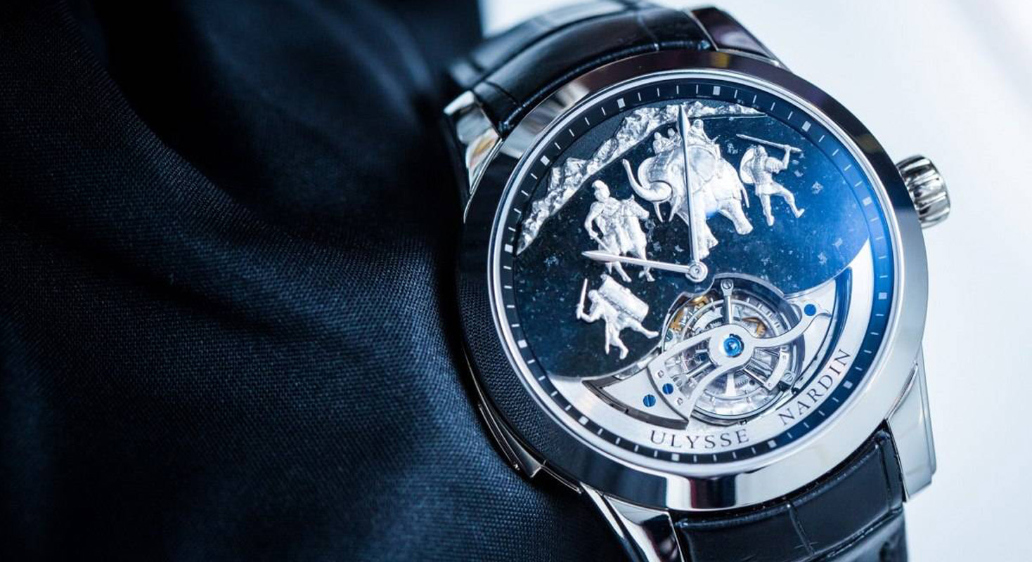
ULYSSE NARDIN HANNIBAL MINUTE REPEATER TOURBILLION

Undefinable a dream watch, 30 pieces in the entire world, and cost of a fortune, this rare timepiece is the exact dedication to royal and prestige class in the world, I must say. A crazy beautiful and antique depiction of the army journeying in a war featuring the military history. What makes this watch such unique and immortal is a fact that it is a dispute between Art and War where both of them support each other. Where both go simultaneously hand in hand and both complement each other. Undoubtedly the Art is beautiful and War comes with its horrors, but let’s go into the literal sense of both the happenings. In War, we fight for life, whereas Art helps us to understand the nature of life, the way it works, the way it should work and how it is ruined, the complexities that ruin the smooth of life. The watch takes its inspiration from a conflict, which is much more ingenious as to conflict between Art and War or the conflict between mechanical and literary. The Art on the watch shows the Hannibal and his men crafted in white gold and set on a dial of graphite where Hannibal and his army of elephants is en route to their war with Rome across the mountains. The literal meaning is quite ubiqutious, whether war in art is the same as the war in life. It could be a metaphor for the internal conflicts that rage inside each and every one of us, this is what the watch that costs you a fortune is playing in–the literal meaning of Life and War and Art and its Theory.
ULYSSE NARDIN HANNIBAL MINUTE REPEATER TOURBILLION

ULYSSE NARDIN HANNIBAL MINUTE REPEATER TOURBILLION<br />” class=”img-responsive” src=”https://lapol0.s3.amazonaws.com/media/None/tourbillon-lapolo_uIHJrQd.jpg” style=”width:100%” /></div><p><strong>LLOYDS BANK</strong></p><p>The seventeenth century saw a rise of decorative symbols since people were not used to alphabets owing to illiteracy. In fact, the distinctive designs and symbols would help the consumers identify the brand with much ease. The black horse symbol was inherited from goldsmiths the forerunners of the modern banks. By 1728, the black horse was initially being used by Lombard street goldsmith which later was overtaken by Lloyds bank. The bank had its own symbol as a beehive that represented thrift and industry which was combined with the black horse and resulted in the present logo of the bank. The galloping horse with design ornamenting it in black and white shades makes the logo look more attractive. The logo featured extensively in promotional and advertising campaigns and enriched raising public awareness of the Lloyds Bank name around the world. The symbol thus became the most favorable symbol in that time. The horse is also often referred to as “ The black horse”. However, the ultimate idea of the logo</p><div class=
LLOYDS BANK ,LLOYDS BANK LOGO<br />” class=”img-responsive” src=”https://lapol0.s3.amazonaws.com/media/None/lloyds-bank-1-lapolo.jpg” style=”width:100%” /></div><p><strong>LEVI STRAUSS </strong></p><p>Just as some usual brand would adopt a method, Levi's founder had something innovative and completely disparate in his mind. The idea evolved from the fact that not many people were aware of the words in the west and eglish was unknown to the entire world and educateion was not in hthe hands of reach of majority, which paved a new way for symbols. The brand that prides its heritage and its accomplishments had to have a logo that is meticulously rememberable. In 1873, Jacob Davis and company founder Levi Strauss invented their first blue jeans and had to convey their work to their customers that the jeans is comparatively strong and long lasting. The quality of their jeans was appreciable and incomparable and to create the effect they invented the two horses in opposite direction tearing jeans in vain. The purpose behind their immediate consideration was the patent that was to expire in some years. Later, the jeans gotta be famous for the title “ the jeans with the two horses”. The company was then onwards recognized to be known as “two-horse brand” till 1928 after which they adopted Levi’s trademark. The idea behind the logo remains as much the same as it was 125 years ago and is continuing to spread the same message since then. There have been modifications and renovations in the ogo but the basic concept and the ideology has been constant. Funny, how two horses and one message game played and ruled the entire clothing brand. That was the effect of using a symbol of an animal that is qite a shar, and storng animalm and the jeans that could resist the tear of a strong organ.</p><p><img alt=” class=”img-responsive” src=”https://lapol0.s3.amazonaws.com/media/None/LEVI-STRAUSS-lapolo.jpg” style=”width:100%” />

THE RED HORSE BEER BOTTLE

A deeply hued lager with distinctive sweetish taste balanced by a smooth bitterness that leads in a strong alcohol kick. If you’re in the Philippines this weekend and looking forward to having a great time with friends, everyone chiming in with their own tales of comedic debauchery, you should not afford to miss the empirical Red Horse Beer Bottle. So, the exquisite beer comes with undying myths and lots of stories behind itself mking it the most loved beer all across Philippines. One of them includes that the beer comes with a mixed notion of gin and thus comes its more intoxicating effect. The extra strong beer is a mystery or it is formulated in such a way is unknown till date. The Philippines has a good amount of best alcohol, is Internationally recognized and exported in all parts of the world. But the red beer story is more appealing and intriguing to the consumers. The story behind the enriching taste of this beer is:

Among all those red horse bottles of beer in the Philippines there is this one bottle that looks completely different with a smiling horse logo because when every other horse is showing its side view with a poker face, this horse is busy smiling and seems to have a lot of fortune and attainment of all need of enlightenment. This horse is smiling and the smile itself is the heavenly, unusual. And then at a time, the red horse bottle is considered to have core of an alcohol content than the other beers which is technically not yet proven. Thus, the story of the mysterious beer is still a mystery and its increased effect on the minds of the consumers is still not known. Some predict it to be pshychologically and some to be just fake rumors. However, you must not miss this beer!

THE RED HORSE BEER BOTTLE , THE RED HORSE BEER BOTTLEL LOGO<br />” class=”img-responsive” src=”https://lapol0.s3.amazonaws.com/media/None/RED-HORSE-BEER-BOTTLE-lapolo.jpg” style=”width:100%” /></div><p><strong>COACH </strong></p><p>Known for its leather products including handbags, watches, luggage, eyewear, footwear, and other accessories, The Coach is a world-renowned American company headquartered in New York City in 1941. The logo remains the most memorable logo in the leatherware industry-designed by Bonnie Cashin, a legendary American artist, and fashion designer. The classic horse is a symbol of luxury, elegance, social status and royal dignity. Of course, horses are a symbol of royalty since time immemorial. Therefore a lot of brands with high etiquette have settled with a horse in their logo. The black color of the logo represents the prestige, strength, simplicity, refinement, and trust in the company. A staple for upper-middle class, the coach’s logo is a best-suited example of how a logo can turn the times of a brand. The minor tweaks have helped the logo to move forward in the company's advertisement and its marketing and a fitting reason to make a change in the classic. The logo has been changed quite often but the color, the font and the background has not lost its significance.</p><div class=
COACH , COACH  logo <br />” class=”img-responsive” src=”https://lapol0.s3.amazonaws.com/media/None/coach-lapolo.jpg” style=”width:100%” /></div><p><strong>MENDIS COCONUT BRANDY </strong></p><p>The image of an equestrian symbol is itself a remark of royalty, prestige, unaffordable and high status. Released in 2007 Mendis Coconut Brandy is the world’s first clear brandy distilled from coconut and matured in special halmilla wood casks. Its first release was sold for $1 million. Quite too much, isn't it? The logo of the bottle represents more of a unicorn adding to the poise and sophistication of the brandy. The logo obviously is for the fact that the brandy can be a home to the luxury society and its gracefulness can be a taste to only a few. The unusual, yet replinishing brandy derives its ryalty from its ingredianets and is a world fmous brand. Newly launched the brand need to put in a lot of effort to sustain their importance in the market to which a lot of credit will go to its logo.</p><div class=
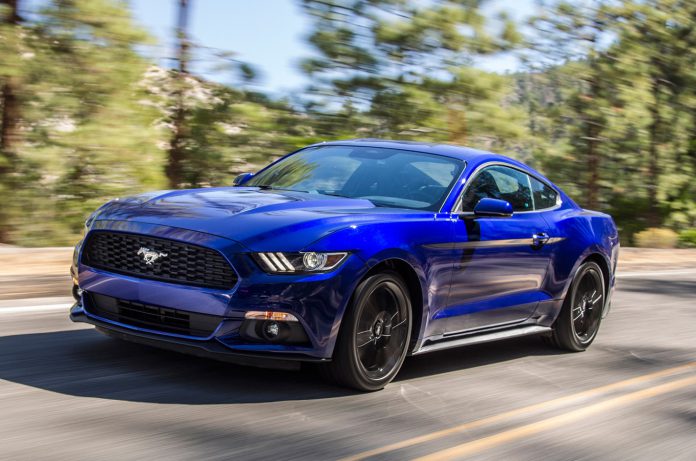
MENDIS COCONUT BRANDY ,MENDIS COCONUT BRANDYlogo <br />” class=”img-responsive” src=”https://lapol0.s3.amazonaws.com/media/None/mendis-lapolo.jpg” style=”width:100%” /></div><p>@Lana Jane Beck</p><p><strong>STANG, FORD</strong></p><p>The most adored logo in the world of a sports car, Mustang prides itself in the logo that was developed after much of hard work and creative designing. Very few people know as to what inspired Philip Thomas to have a running pony as a logo in his new upcoming sports car, Mustang. Philip Thomas was 27 when he was first asked to prepare the logo for the sports car, this being his first project in the Ford had to be a remarkable one. The image of pony came to his mind after 100 days of his creative thinking, and trying his hands out in all possible directions. The famous artist was known to sketch different animals, but his idea of this logo had to have the elements of a new model, something innovative, exuberant that could determine the strength of this car and the American spirit. The logo has also had a lot of conspiracies about why the pony is galloping in the left direction to which the answers were absurd and not art factory. One of those reasons included the left-hand sketch of the artist which was convenient in drawing the horse galloping toward left. However, this may or may not be the story. The big controversy is that even till date after a half-century of the invention we are still unaware of the truth of the basic idea that might have led to the growth of the design. The latest design was modified in 2010 with more skeptical and curvy and a muscular pony thrivng towrad the left depicting a thrill of energy. A remarkable invention.</p><div class=
stang ford ,stang ford logo <br />” class=”img-responsive” src=”https://lapol0.s3.amazonaws.com/media/None/STANG-FORD-logo-lapolo.jpg” style=”width:100%” /></div><p> </p></div></div></div></div></div></div><div id=

Popular Articles